What’s the Point of You?
Existentialist design in an emphemeral age.

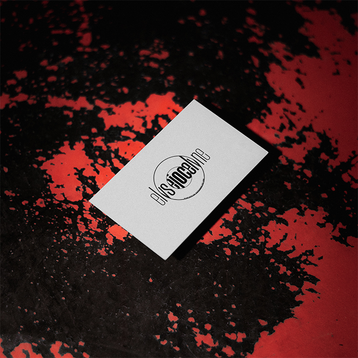
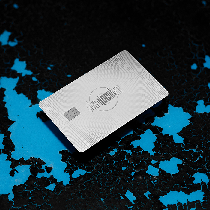
Impasse: How do you capture a qualitative service in a brand?
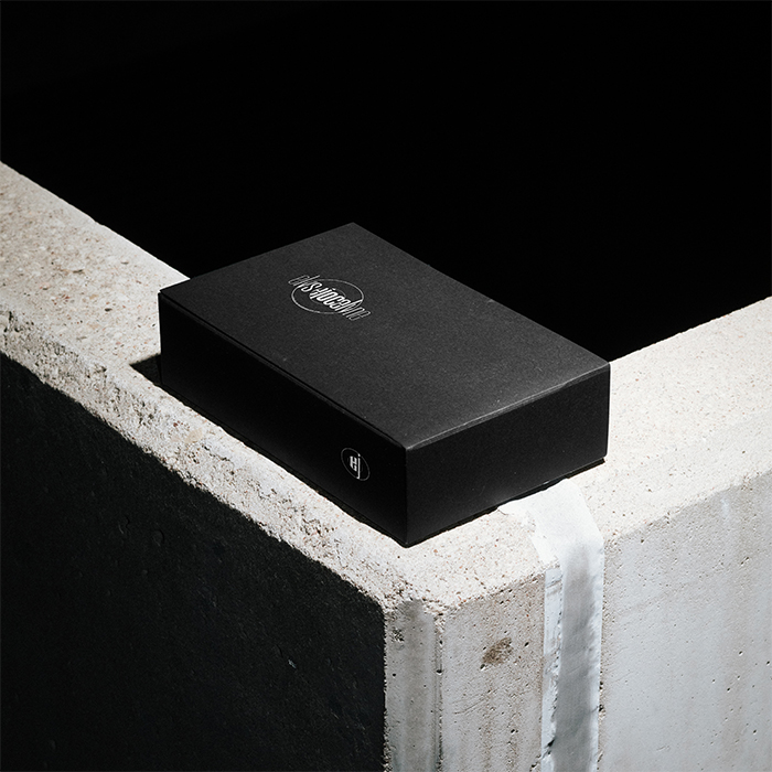
Insight: EJ is selling their perspective.
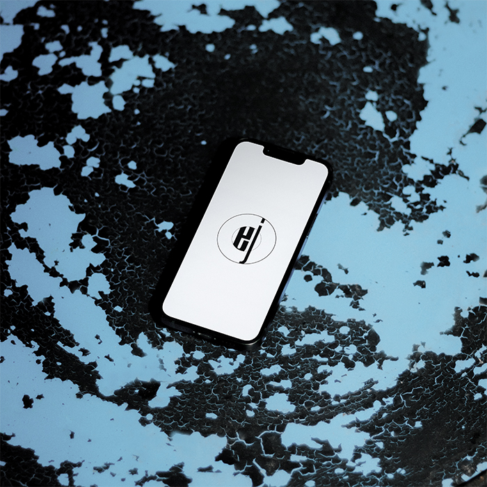
Intent: A brand mark that communicates focus, detail, and vividity.
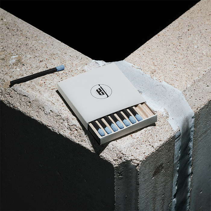
Impact: See Below
Brand
Elyse Jocelyn Photography needed a concrete identity for a growing business that could adapt as it bloomed. The result is a logo and brand mark that’s versatile, distinct, and—with its stylistic nod to retro photography—timeless.
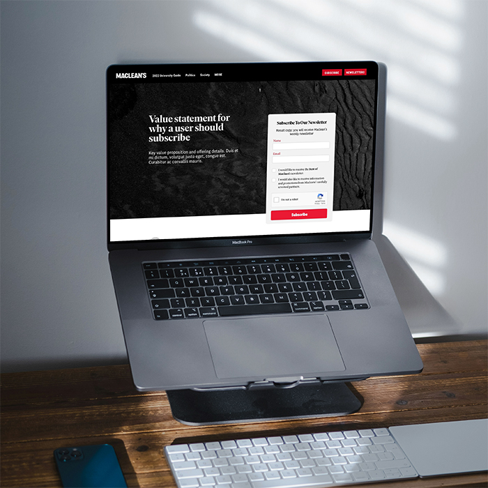
Impasse: New reader retention.
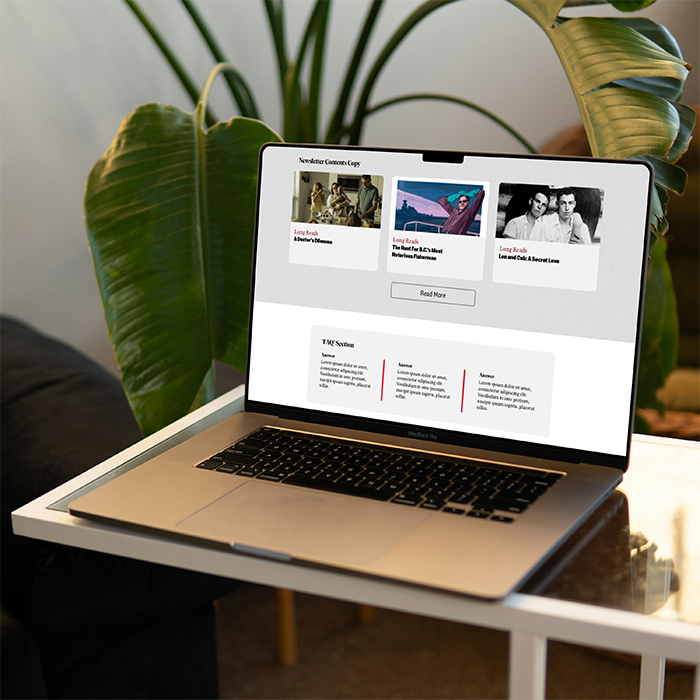
Insight: Maclean’s has a legacy but that isn’t enough for new readers.
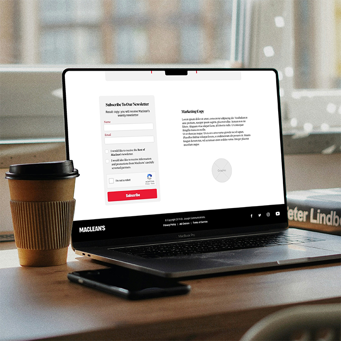
Intent: Clear value statements, compelling newsletters, and useful tools.
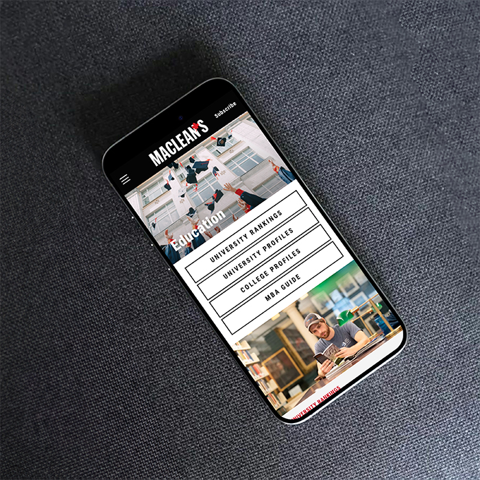
Impact: See Below
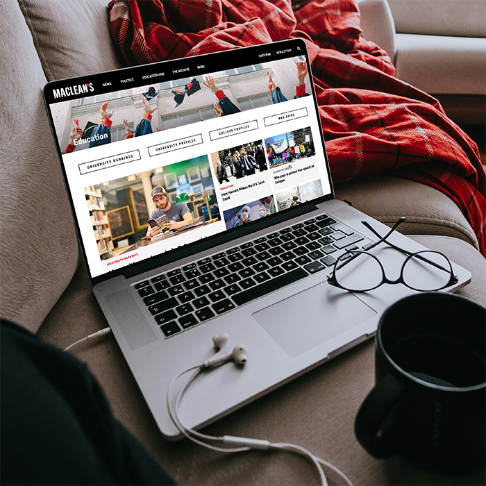
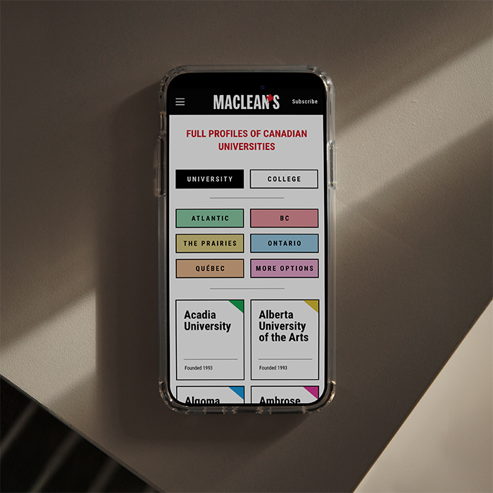
Web
Mike’s work was interacted with by more than 15 million users on macleans.ca in 2021 and, with the fresh implementations, Maclean’s saw an 800% growth rate in new subscriptions – and the same again on Chatelaine, Châtelaine, and Today’s Parent's sites as the work expanded across SJC brands.
In his time at St. Joseph Communications he contributed front-end code and design expertise across all 13 brands as well as to studio clients.
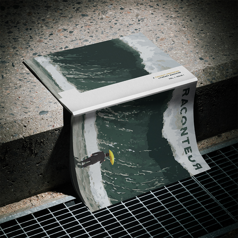
Impasse: A new journal's design has to be distinct but not distracting.
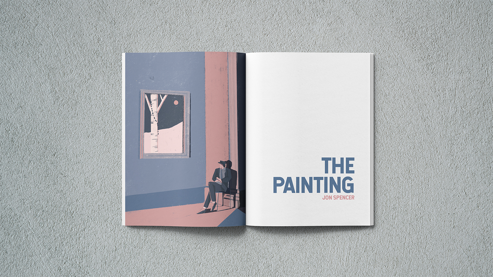
Insight: Raconteur’s art submissions provide an opportunity for colour harmony.
Intent: Bold. Blunt. Bunting.
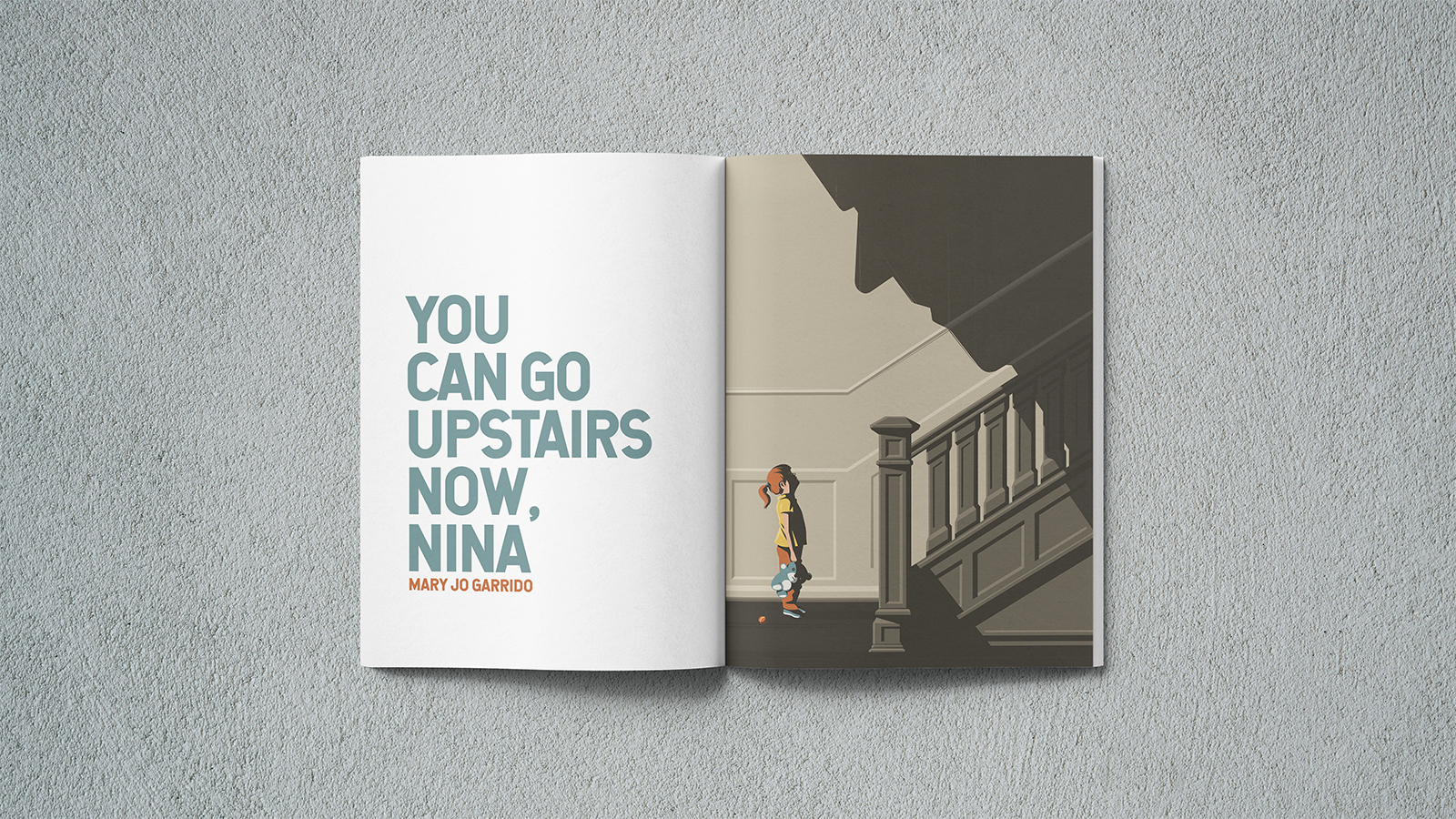
Impact: A journal that appreciates its content without letting white pages and type dominate.
Editorial
Ephemeral as journals like Raconteur can be, art directing an inaugural issue is about establishing an identity on the first print and creating a solid foundation for issues to come. Influenced by editorial design in magazines, Mike pushed white-space to colour-space to connect the art to the writing and leave the formalities to the stories themselves.
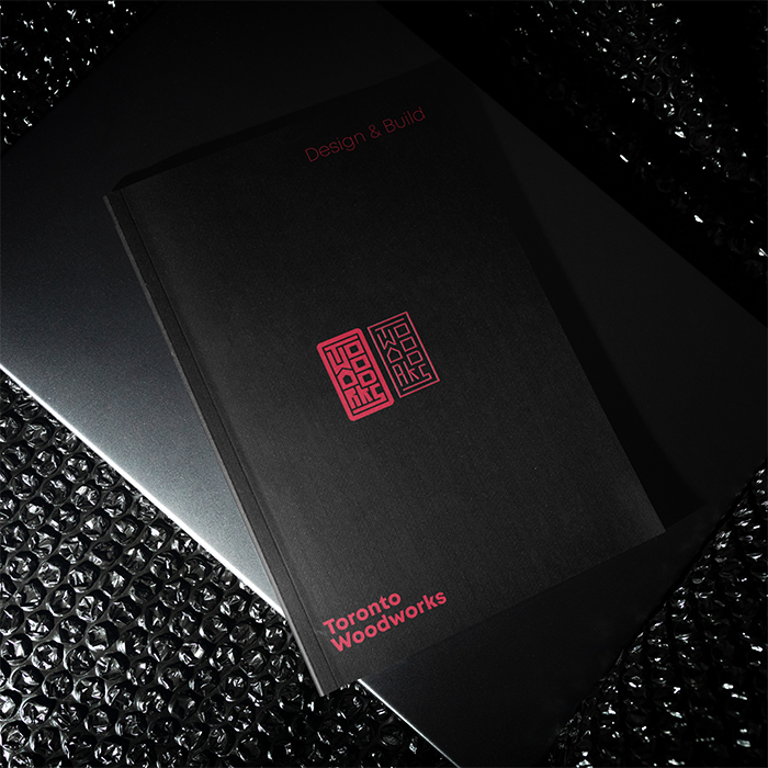
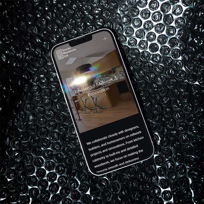
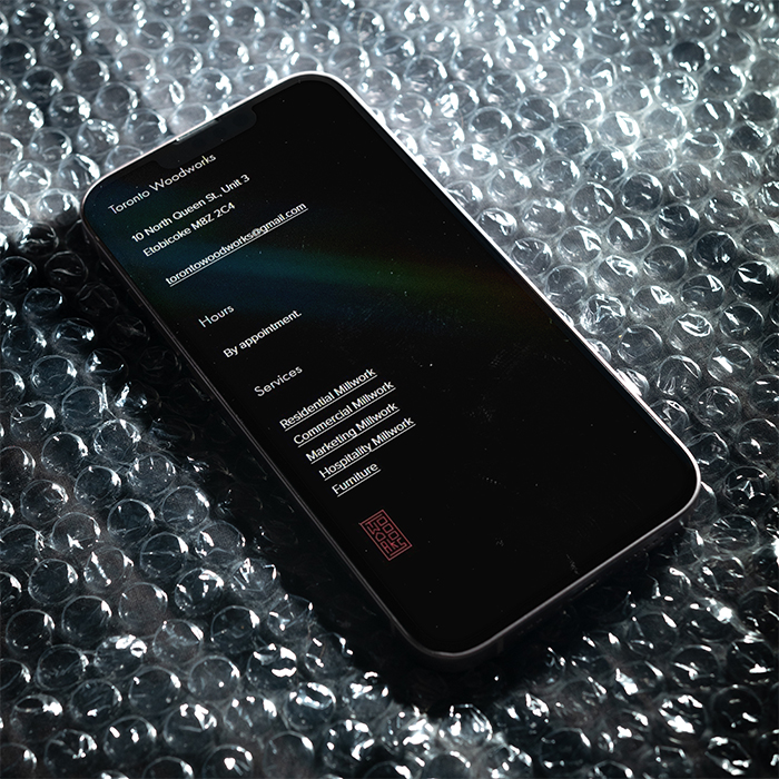
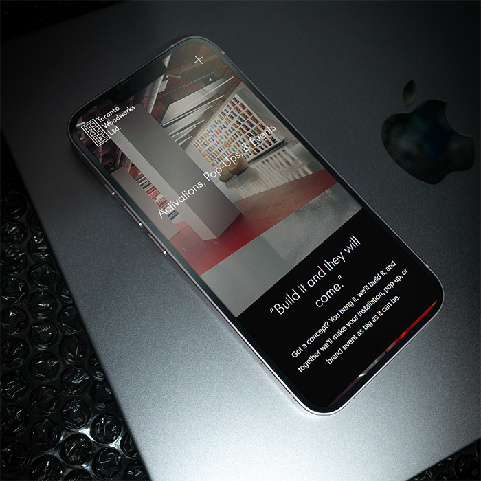
Impasse: An established company needs an update.
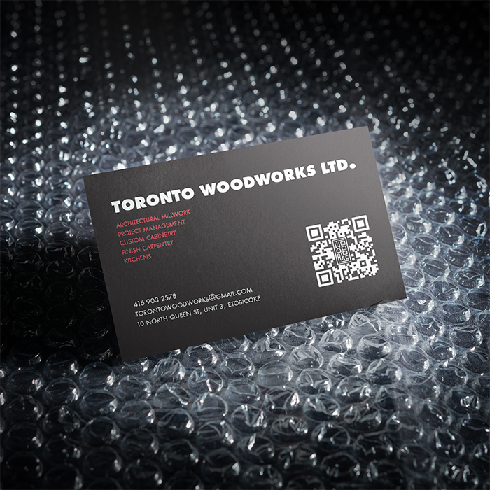
Insight: Toronto Woodworks’ products speak for themselves – let the voice match.
Intent: Capture historied carpentry and modern tools in solid structure.
SEO
Toronto Woodworks’ aesthetics are inspired by mid-century modern luxury and refined Japanese minimalism but their style of business rejects pomp and ceremony for dependable approachability; their branding and voice needed to match that. After Mike developed a brand identity and brought TO Woodworks’ website into alignment with modern SEO and accessibility standards, they saw a 300% increase in web traffic and unique visitors (a third coming from organic search), and an improved conversion rate, making the new site more than competitive.
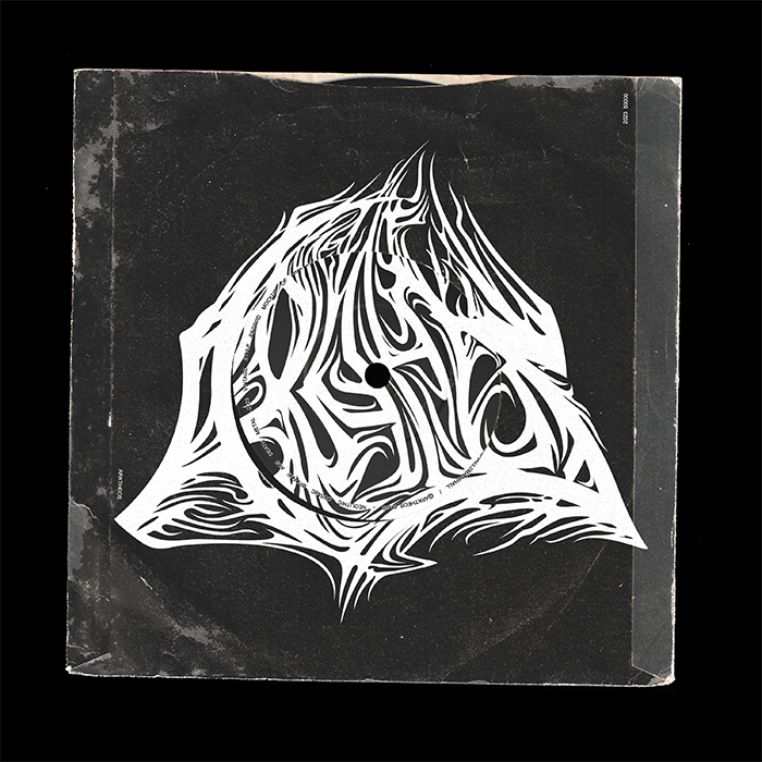
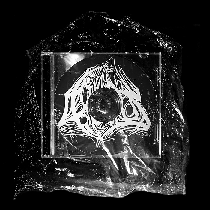
Impasse: A battle between genre conventions and bronze-age sensibilities.
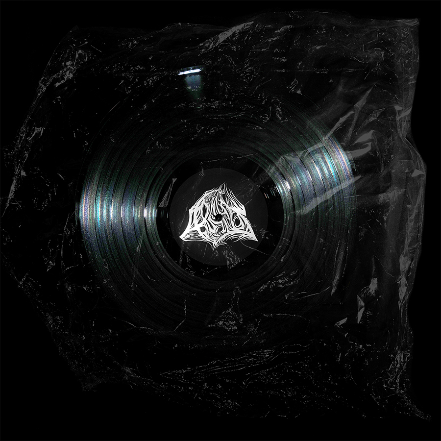
Insight: Uniqueness can be derived from structure as much as detail.
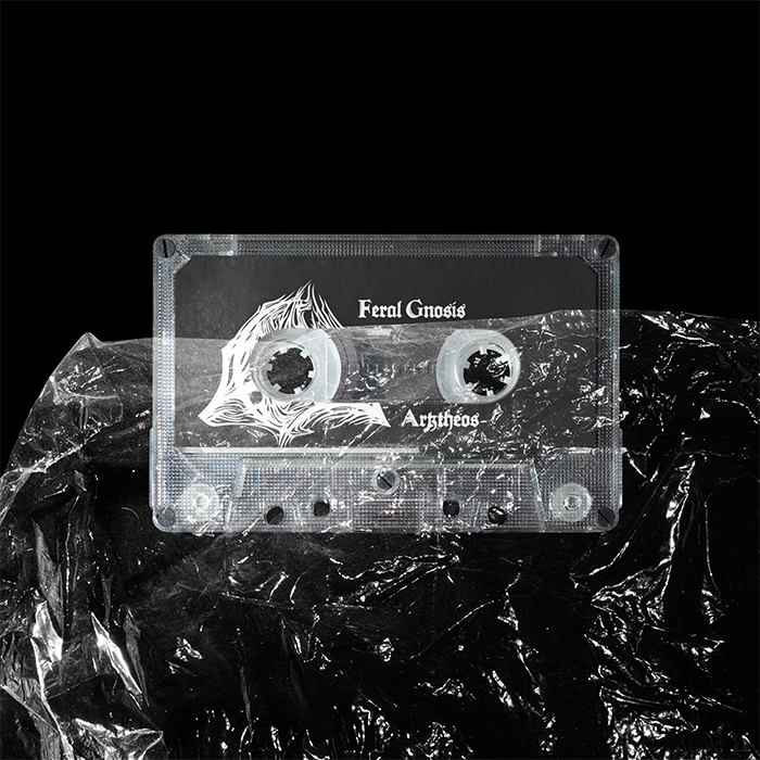
Intent: Impressionist harmony behind writhing complexity.
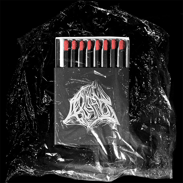
Impact: A logotype that respects the heritage but makes no bones about who Arktheos are.
Merchandise
For the uninitiated, Death Metal bands trade on inscrutable logotypes; for Arktheos (from the greek, Arktos– (ἄρκος), meaning north or bear, and –theos (θεός), meaning god) Mike took this standard and injected sacred geometry into the structure, mapping the letters to nodes that match the Ursa Major constellation. The result is a logotype or sigil that evokes the cosmological and prehistoric themes of Arktheos' music, sowing an uneasy harmony on any surface it meets – vinyl, pixel, or otherwise.
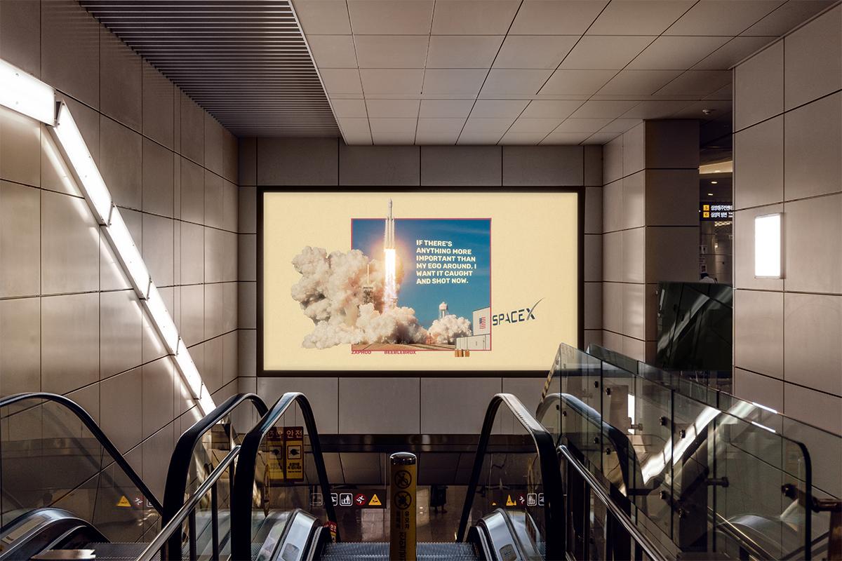
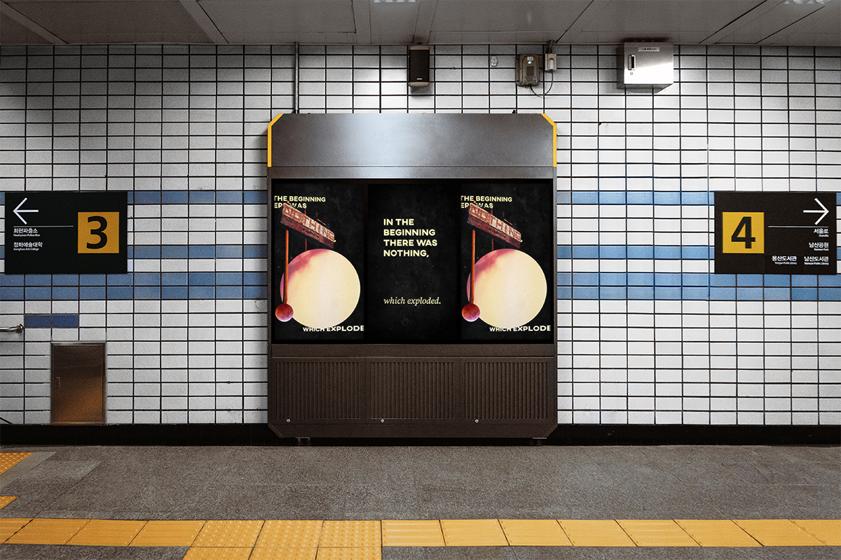
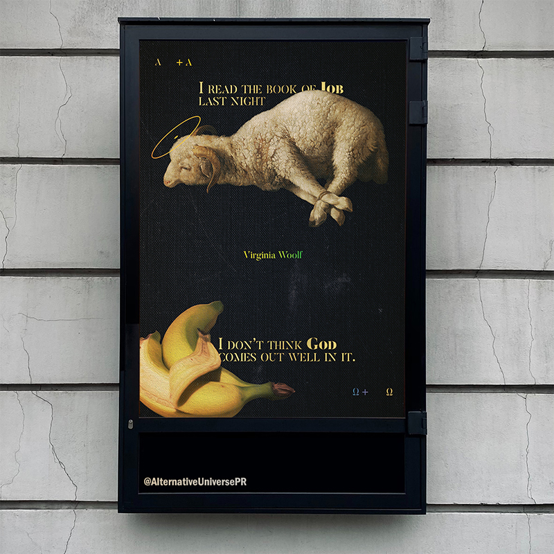
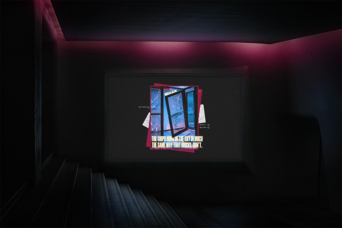
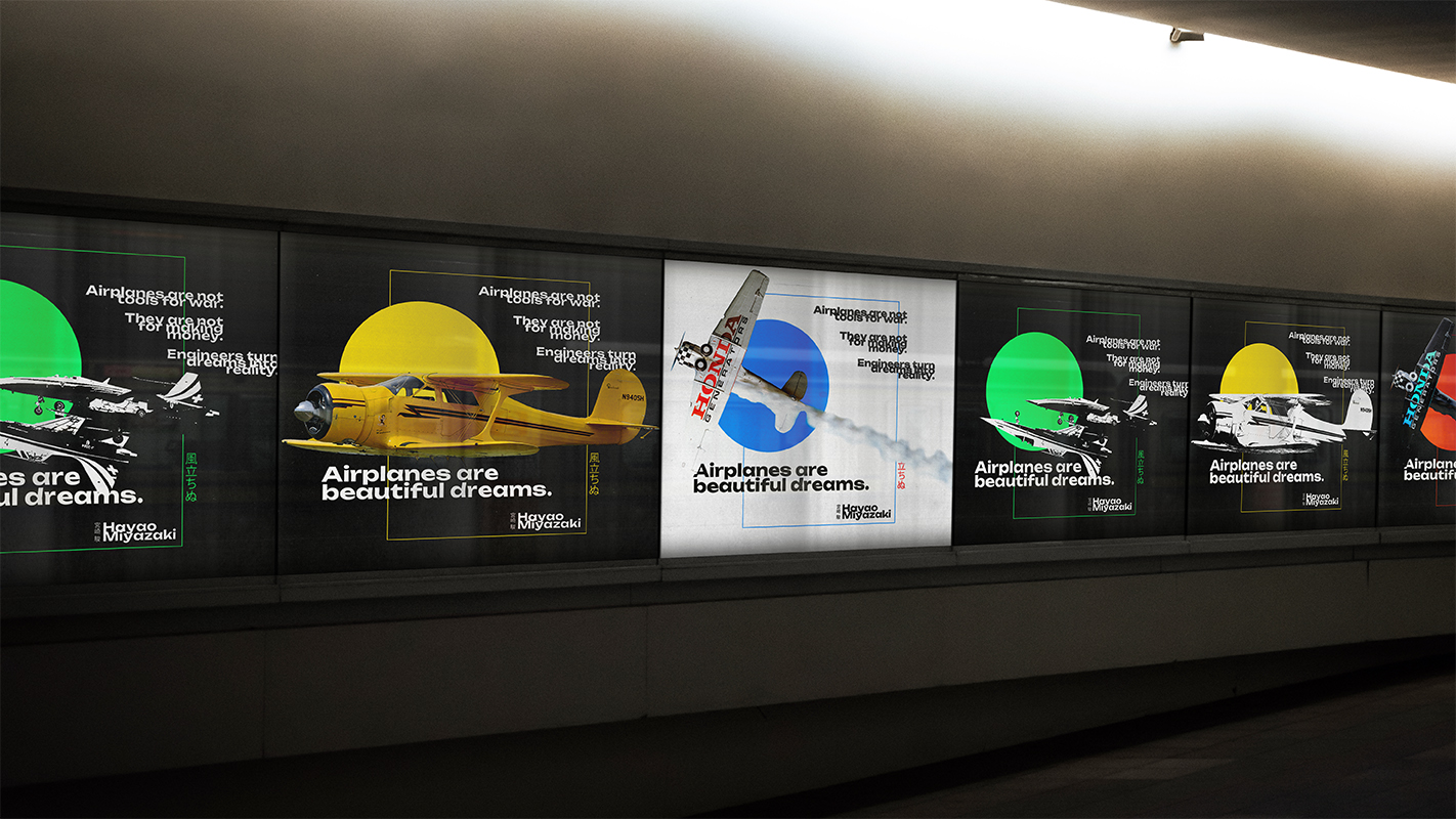
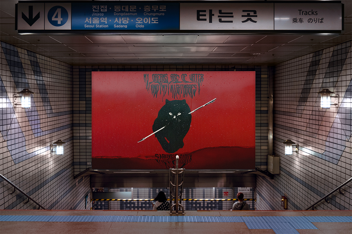
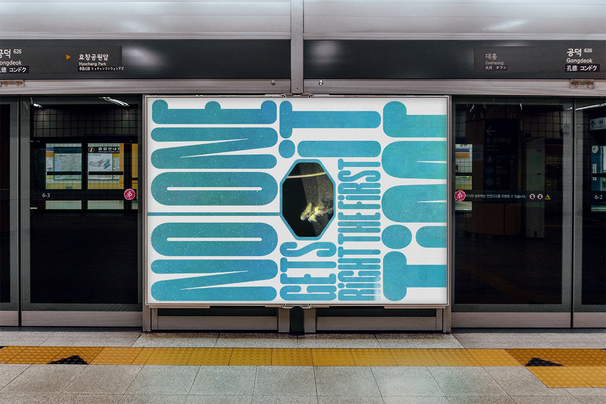
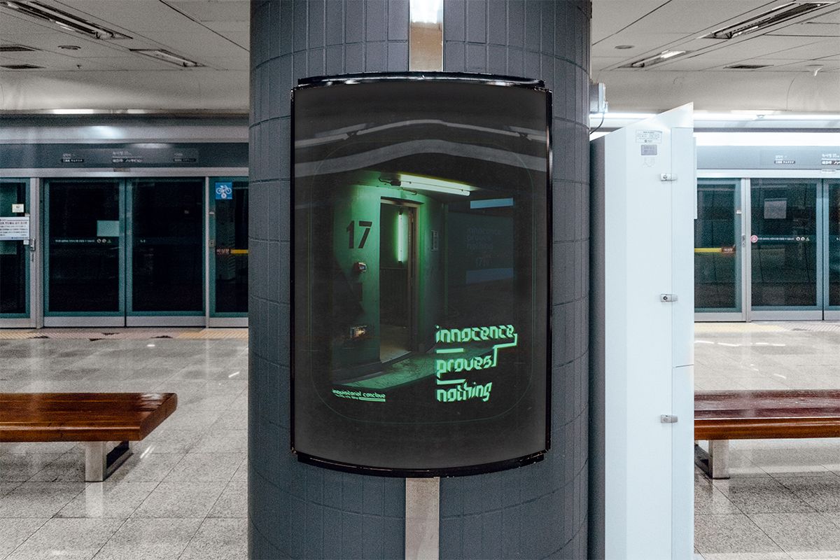
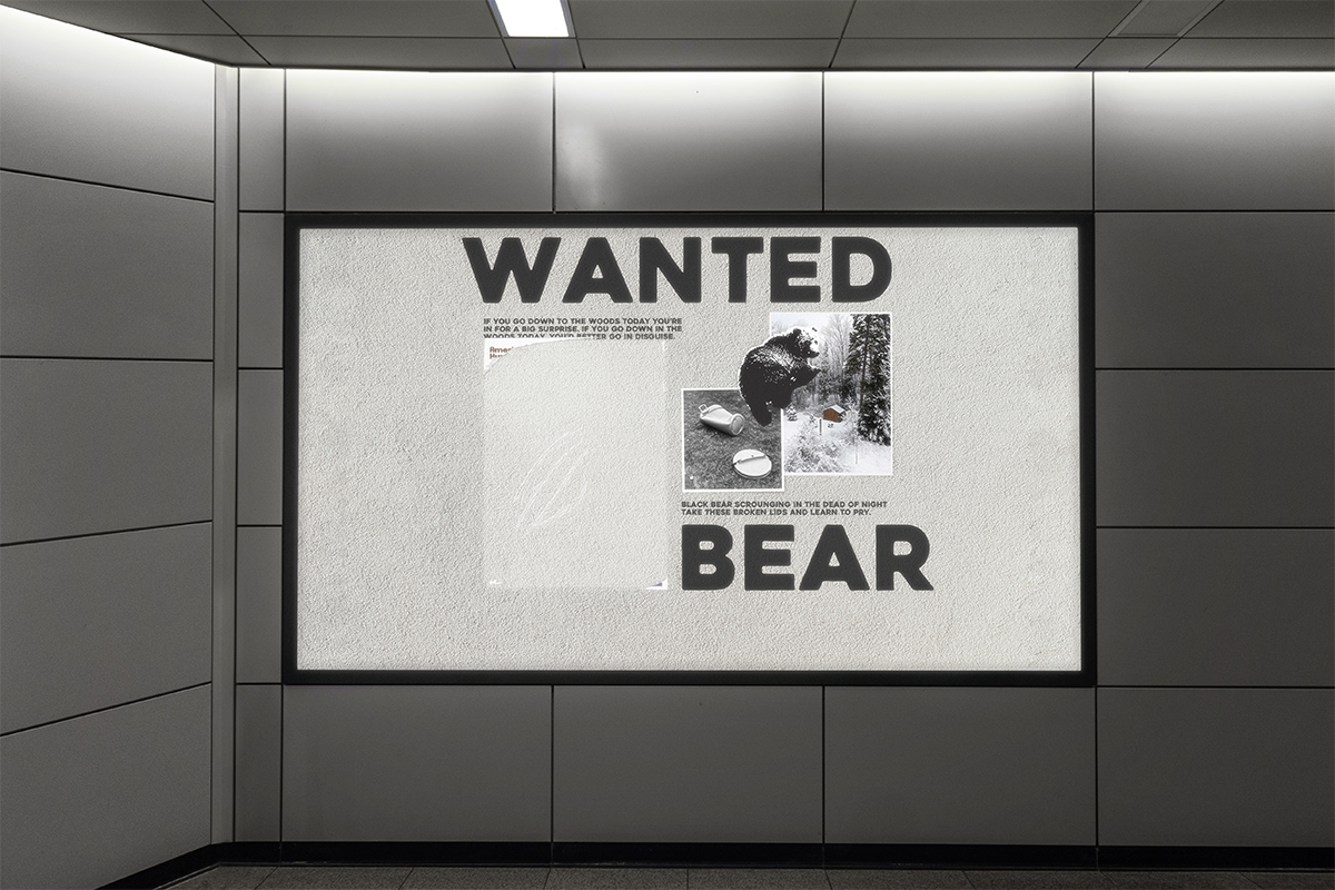
Impasse: Art against linear thinking.
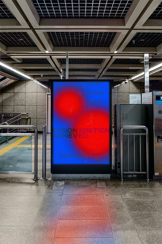
Insight: A blend of science, satire, and literature.
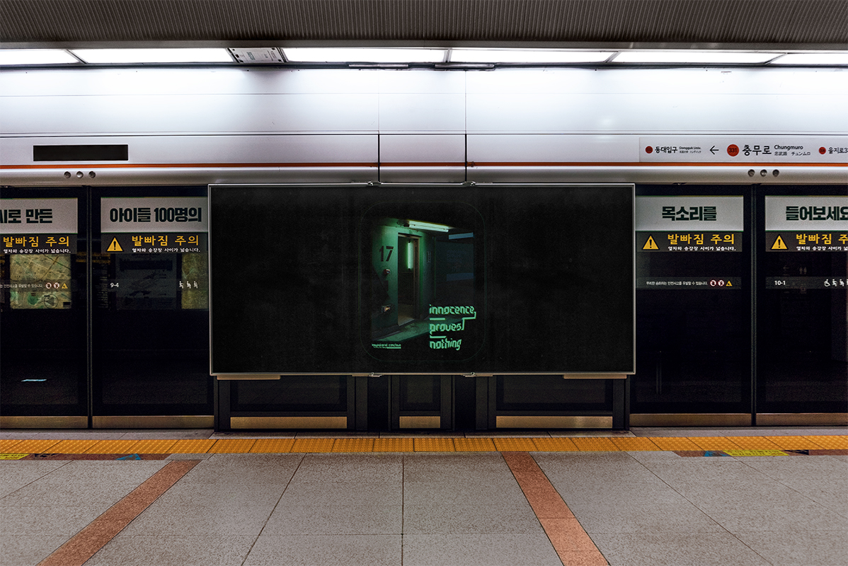
Impact: You tell me.
Art
There’s an important distinction between art and design – purpose. The AlternateUniversePR project straddles that boundary. Demonstrated here on Seoul's subway network, the posters are intended to be quizzical and confounding, offering snippets of authors and artists’ words that conjure up other worlds and commentary on our own. Even the name, ‘Alternate,’ is played against its more appropriate counterpart, ‘Alternative,’ to ask viewers how their realities are defined or eclipsed.
Some of these posters and other prints are available on Mike’s darkroom page.
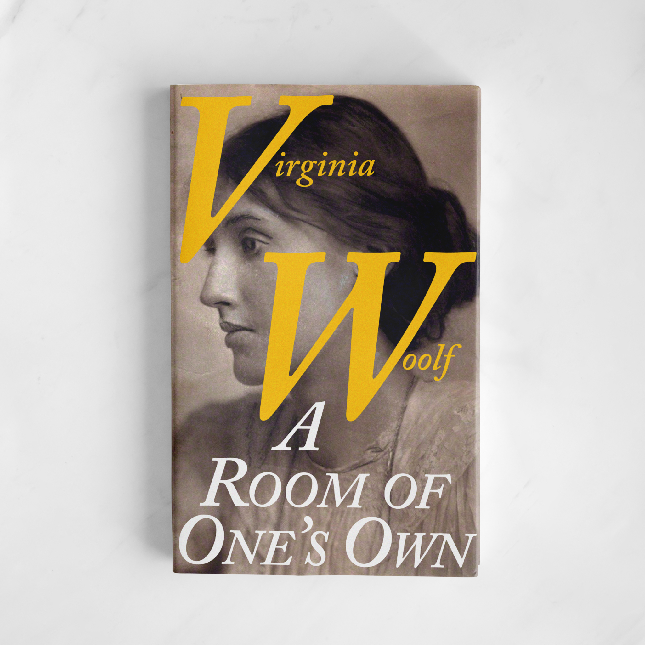
Impasse: What is a book before its read?
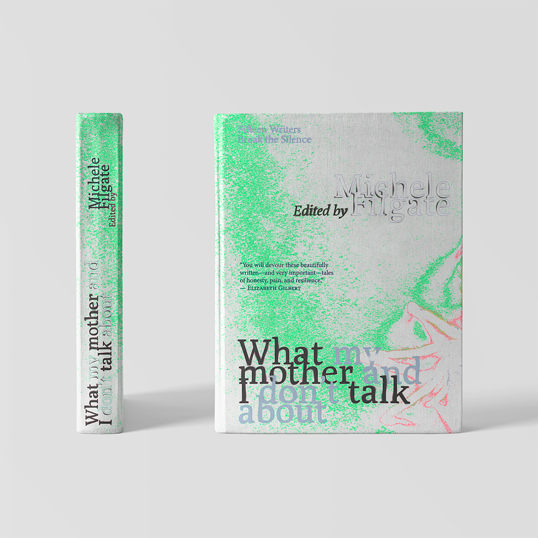
Insight: A book is an object and an invitation.
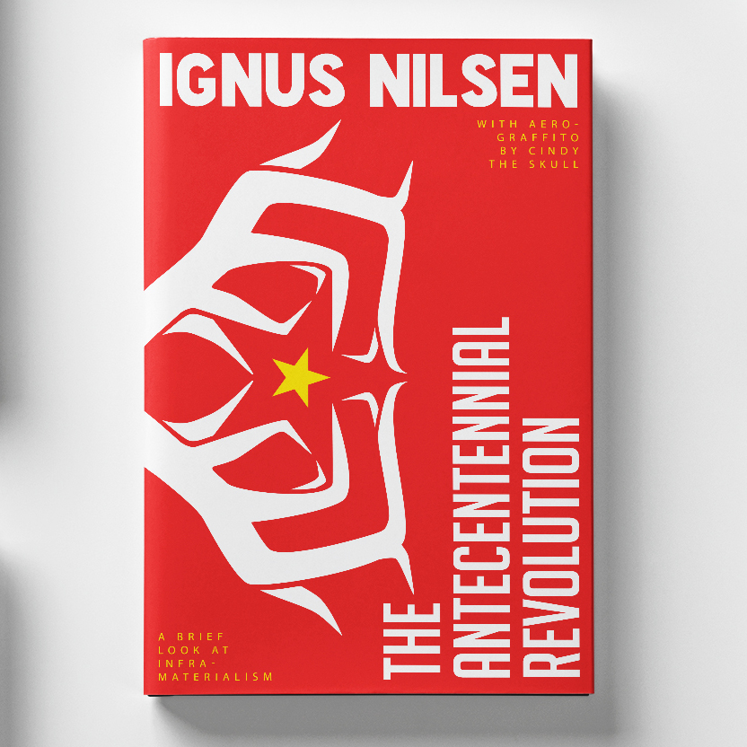
Intent: Invite the right reader.
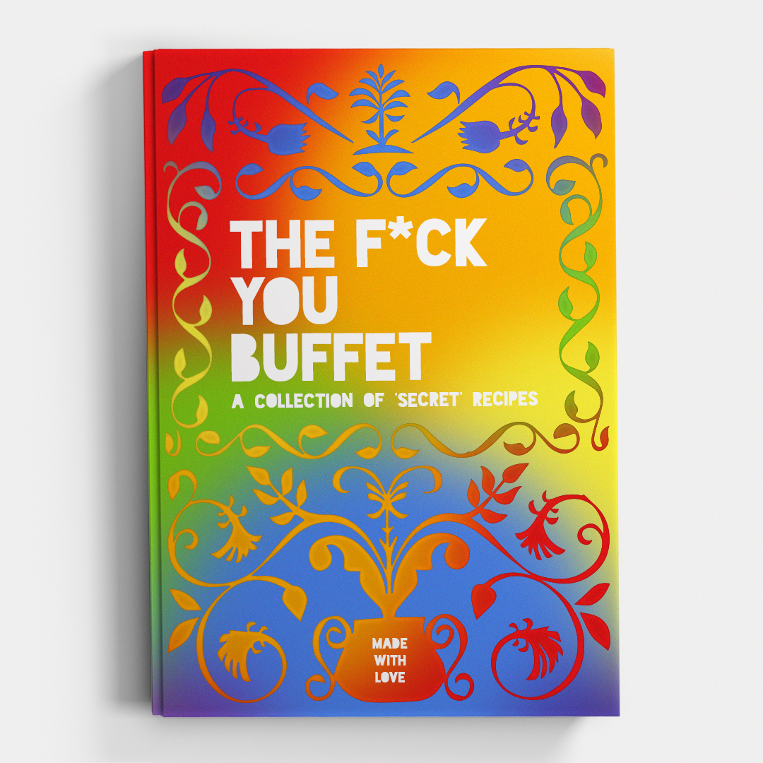
Impact: A series of experiments in what gets a book off a shelf.
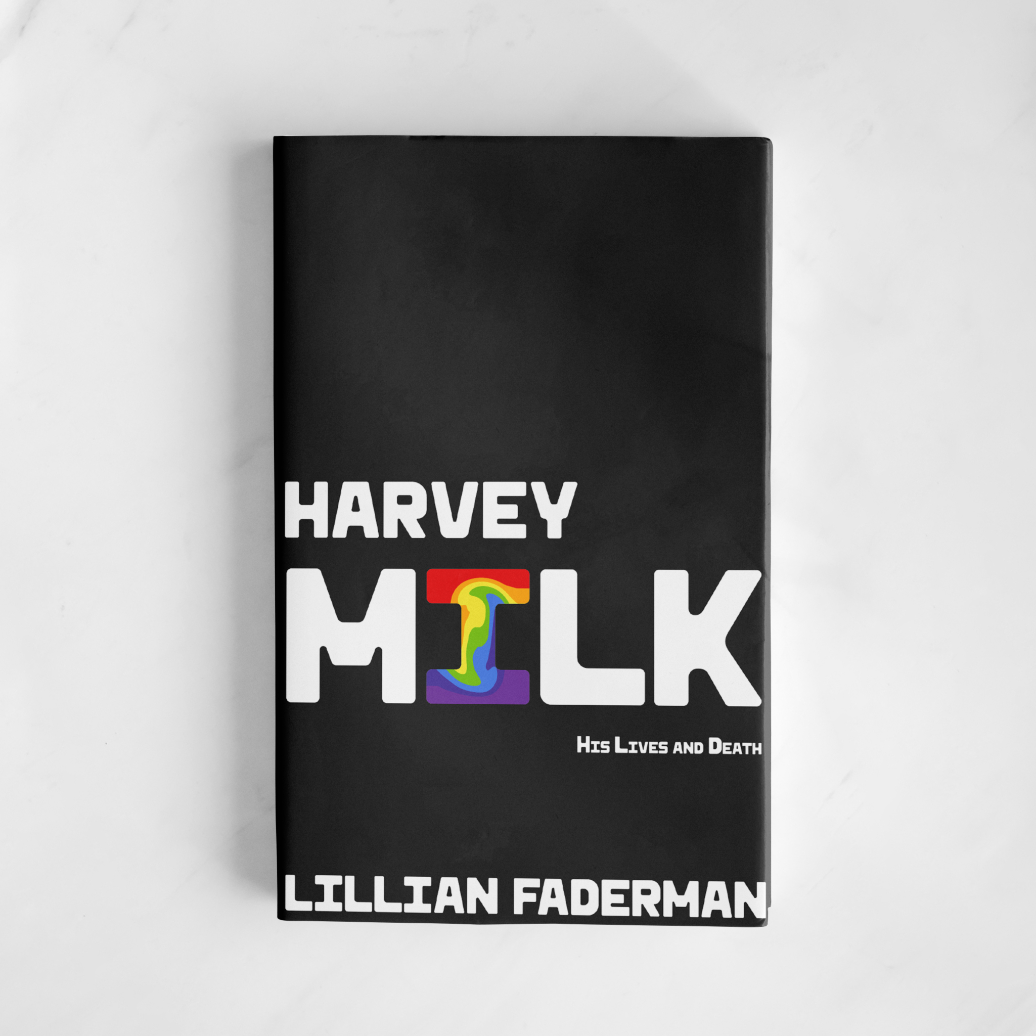
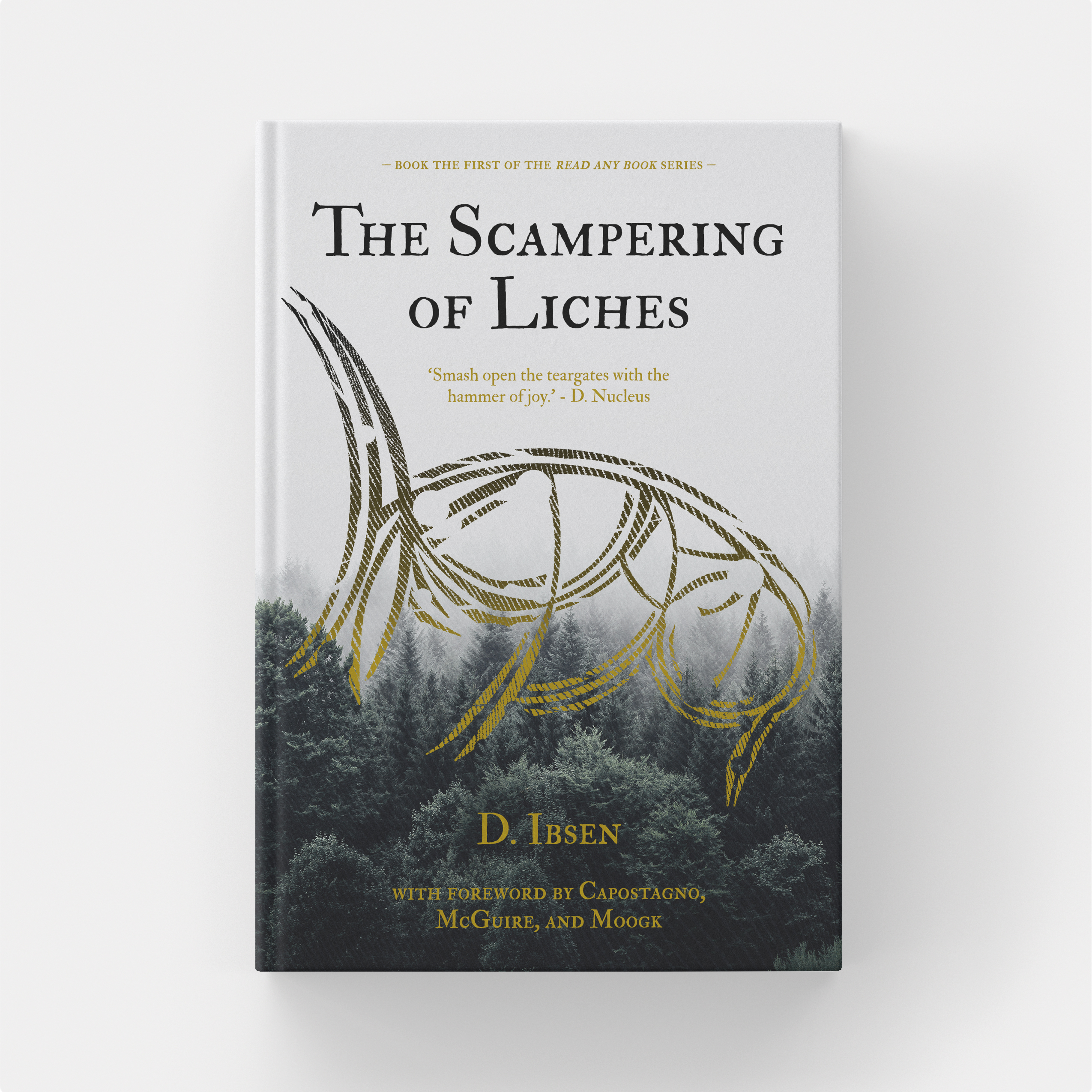
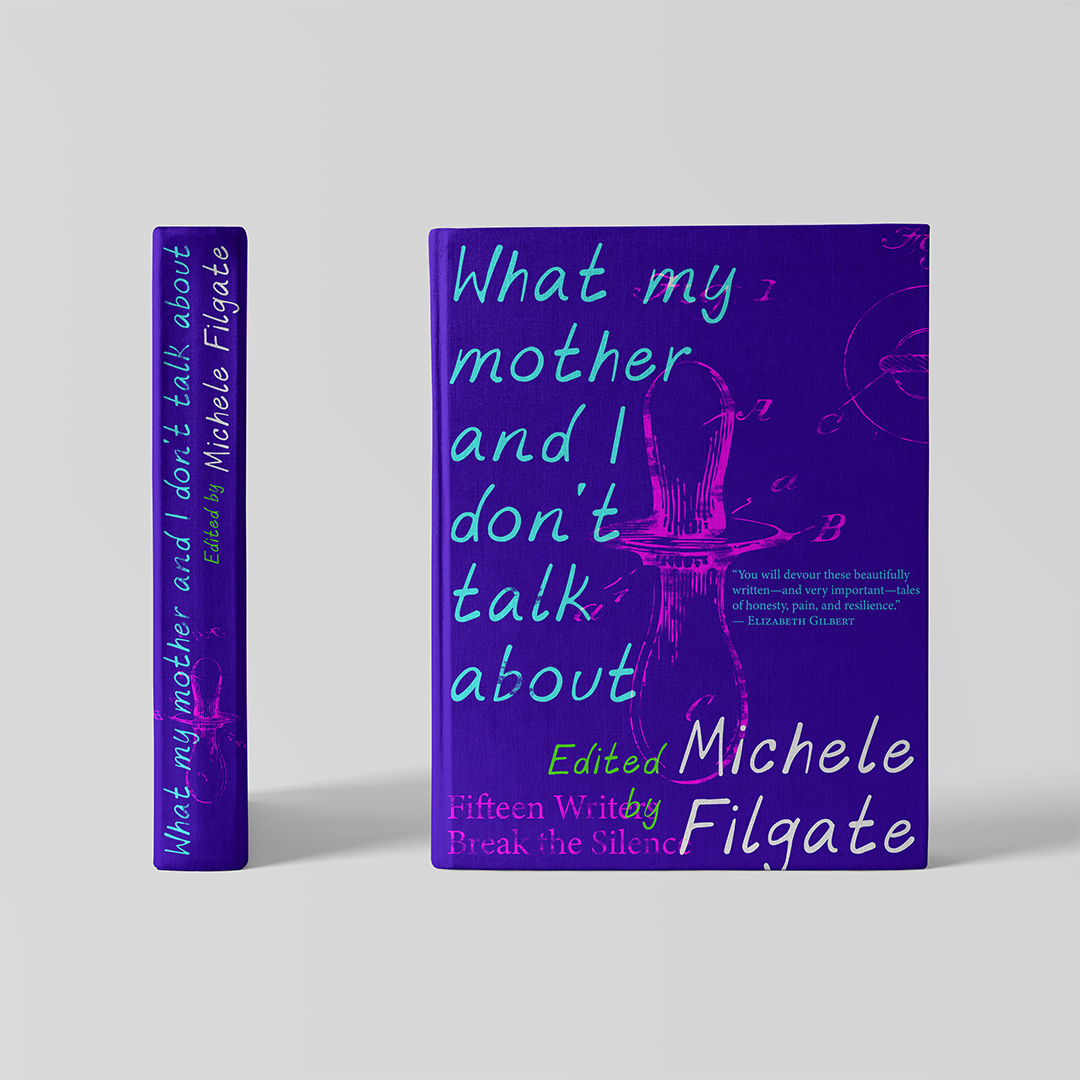
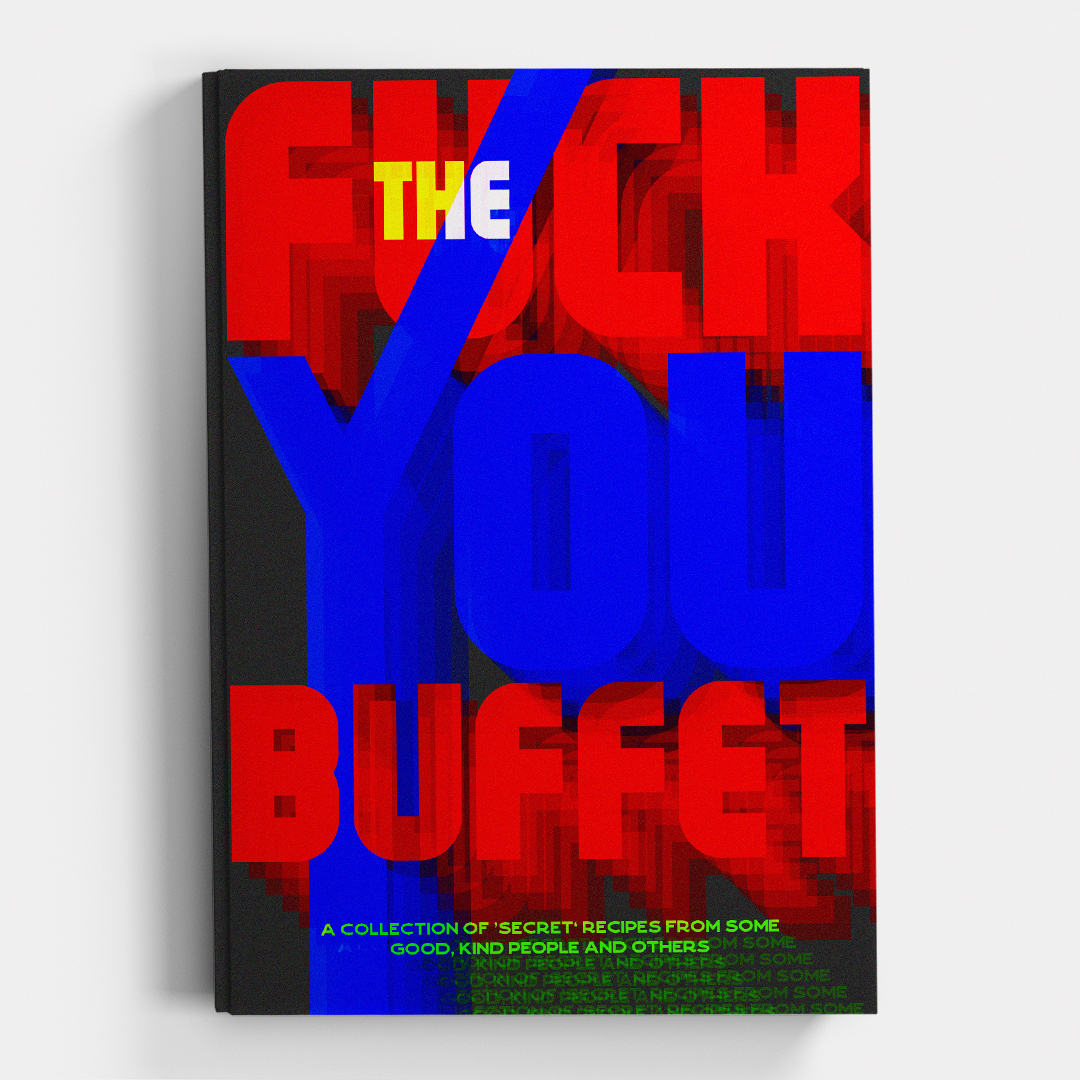
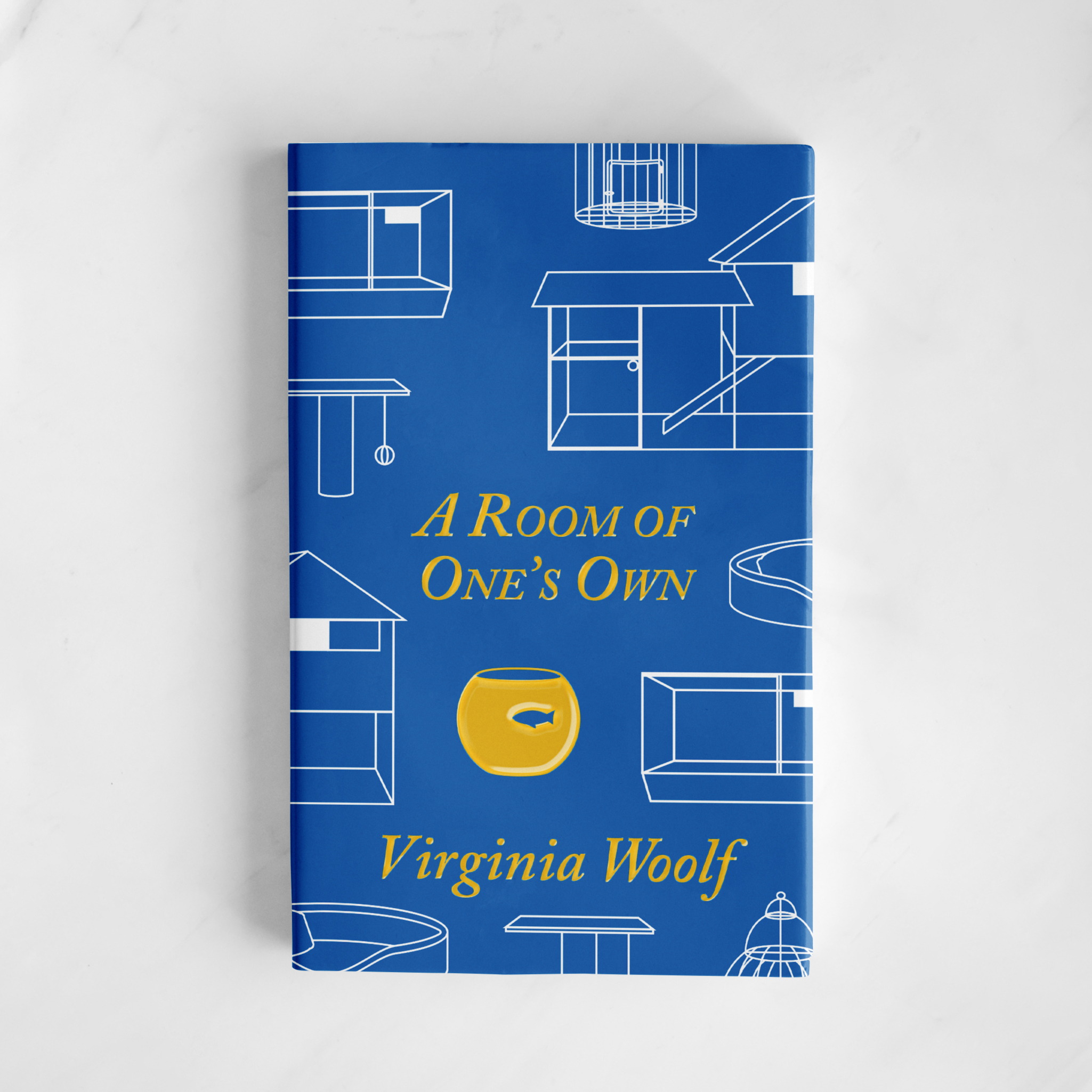
Publication
These covers are a selection from Mike’s experiments in cover design. Some are unique, some have alternates. They represent his process outside of client work as these covers didn’t come with briefs or editorial board direction. Publishing is already risky and so publishers tend to be more risk averse; these tests are an exercise in finding subtle ways to break convention at no cost. The only limitation he placed on himself was to focus on the cover – no relying on die cuts or exposed spines.
Mike’s lucky enough to have held a range of positions on the production side of publishing, while you won’t see these covers on shelves any time soon, you might see their influence in his print-ready books and typesetting.